

1895 by Lavazza
1895 Coffee Designers by Lavazza is a premium coffee line that infuses craftsmanship and innovation into every cup. With a spirited selection of coffee from far-flung places throughout the world, the packaging reflects the unique and memorable tasting profiles and the terroir they come from.
While at RBMM, I worked closely with Philip Smith, Dana Nixon, and Anna Scarmardo to develop a robust system for the packaging as well as designing brand merchandise to support the beautiful
COMPLETED ATRBMM
Trace Element
YEAR2019 - 2022
SERVICESPackaging Design
Illustration
CREDITSVisual Identity: Philip Smith
Creative Direction: Philip Smith
Art Direction: Philip Smith, Geena Sisomphou
Design: Geena Sisomphou, Dana Nixon, Cristina Moore, Yvette Sierra
Illustration: Geena Sisomphou, Dana Nixon, Cristina Moore, Yvette Sierra
Brand Management: Anna Scarmardo
Specialty Blends
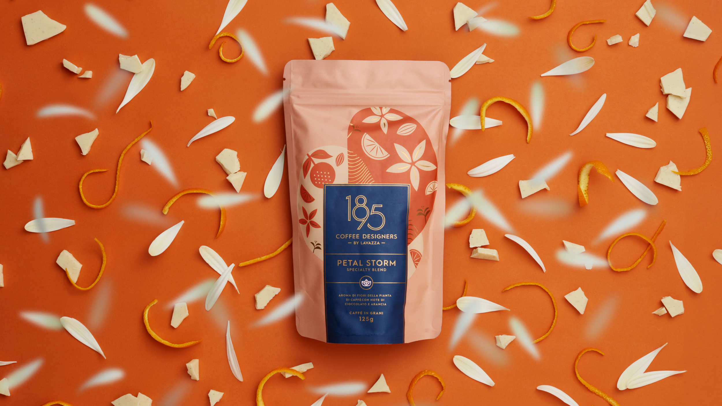
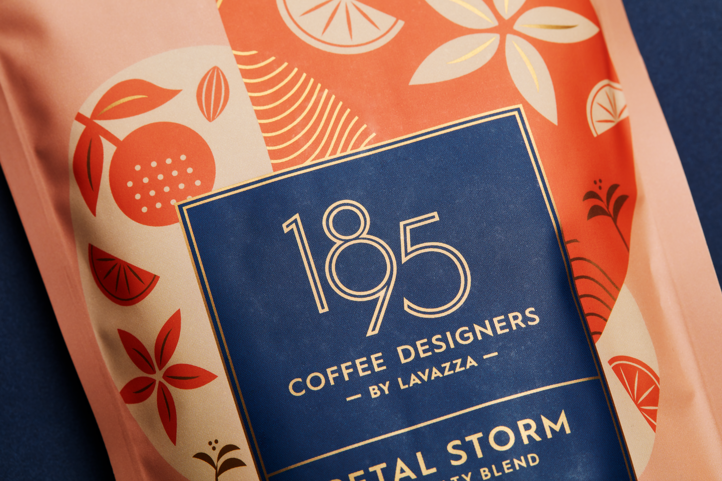
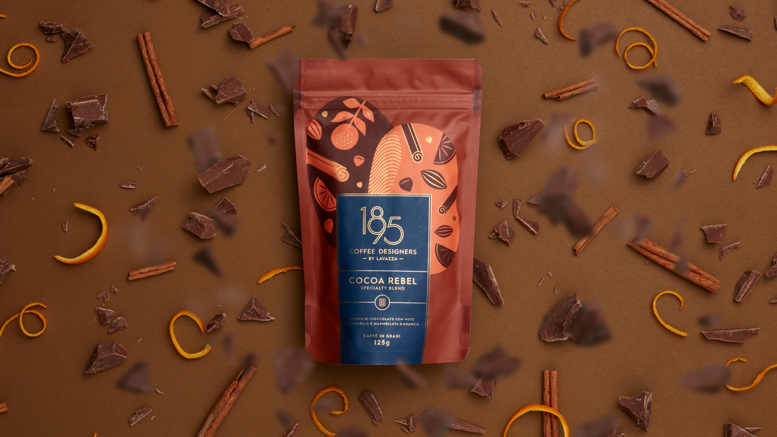
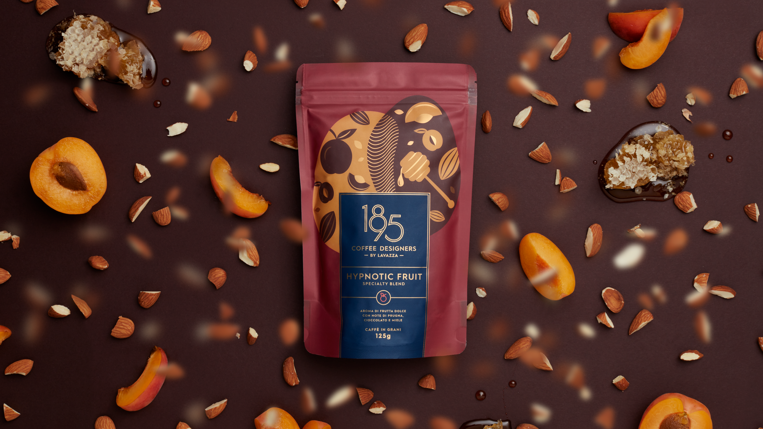
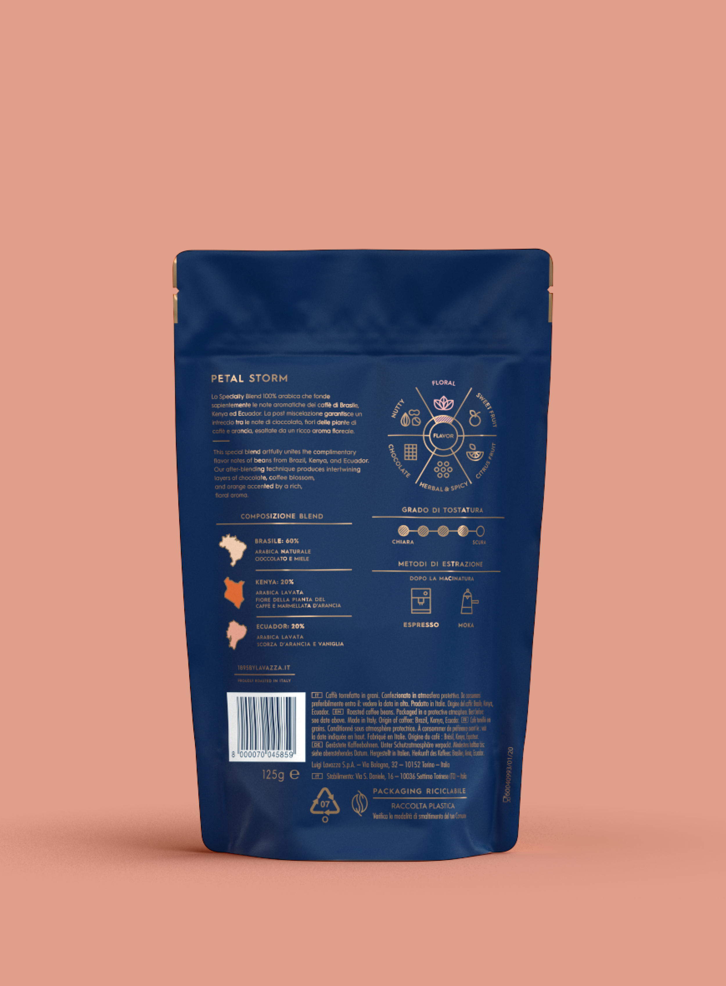
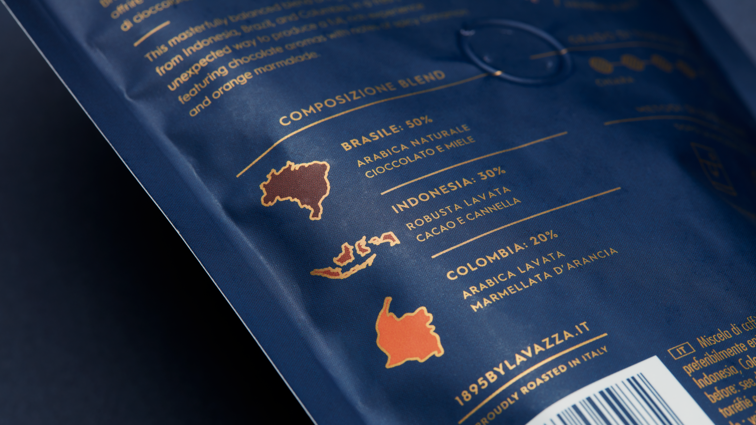
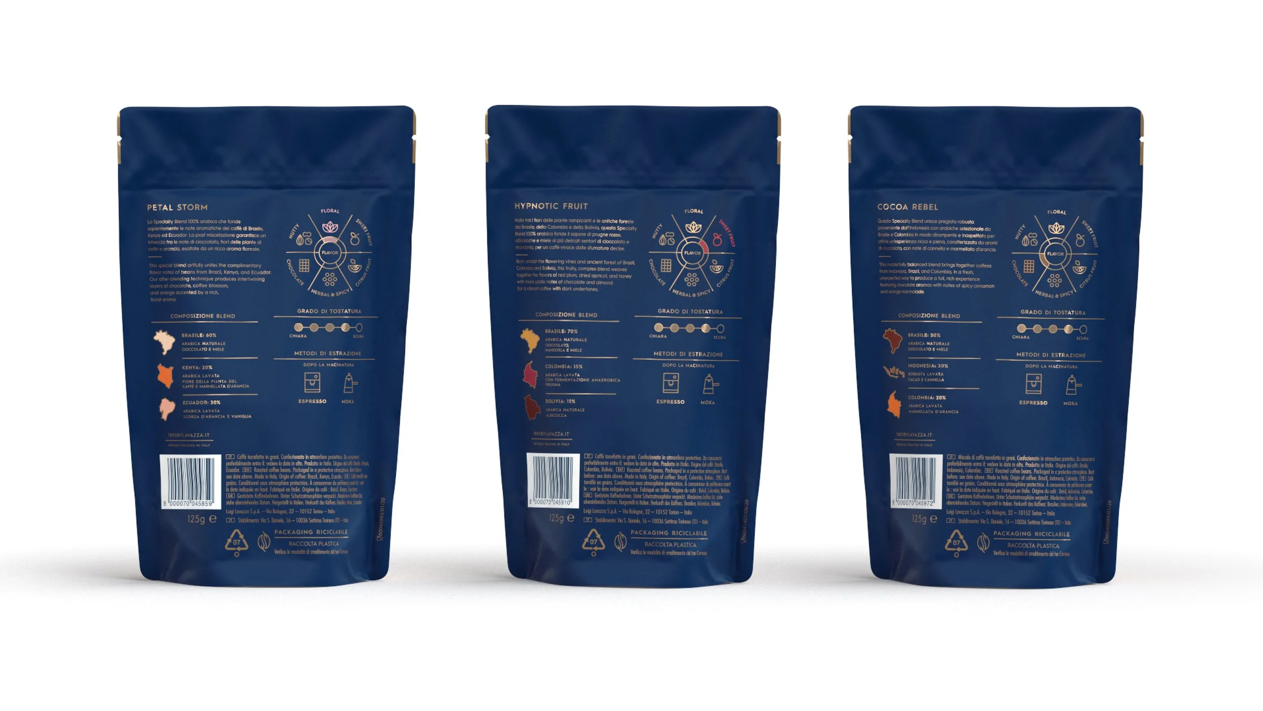
Across the entire line, the back of the packaging was an opportunity to emphasize Lavazza’s expertise and commitment to coffees that are fully traceable to the field they came from. A bit of education for curious coffee drinkers and, at the same time, a way to hook coffee snobs who might otherwise turn their nose at the mention of the word blend.
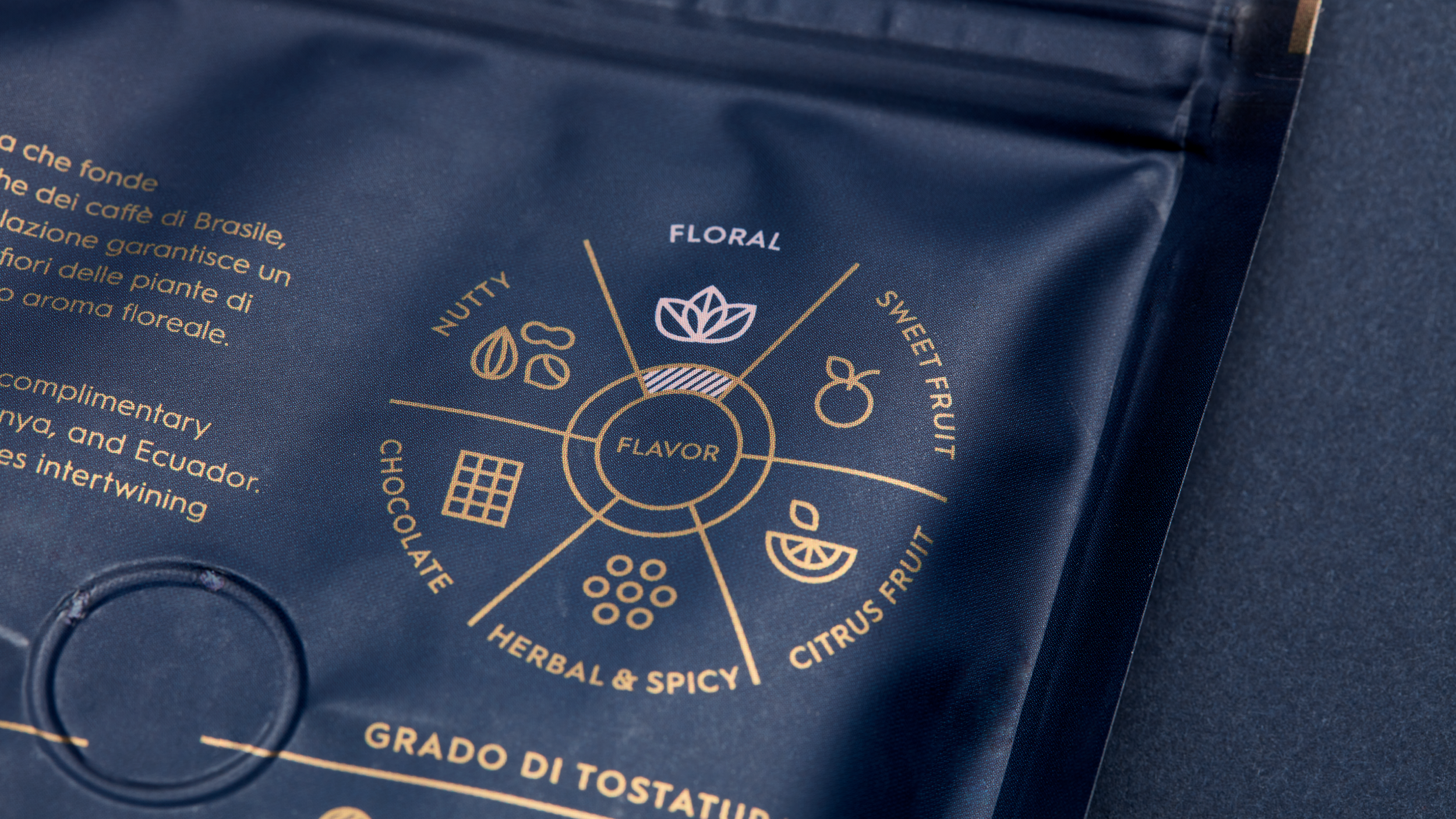
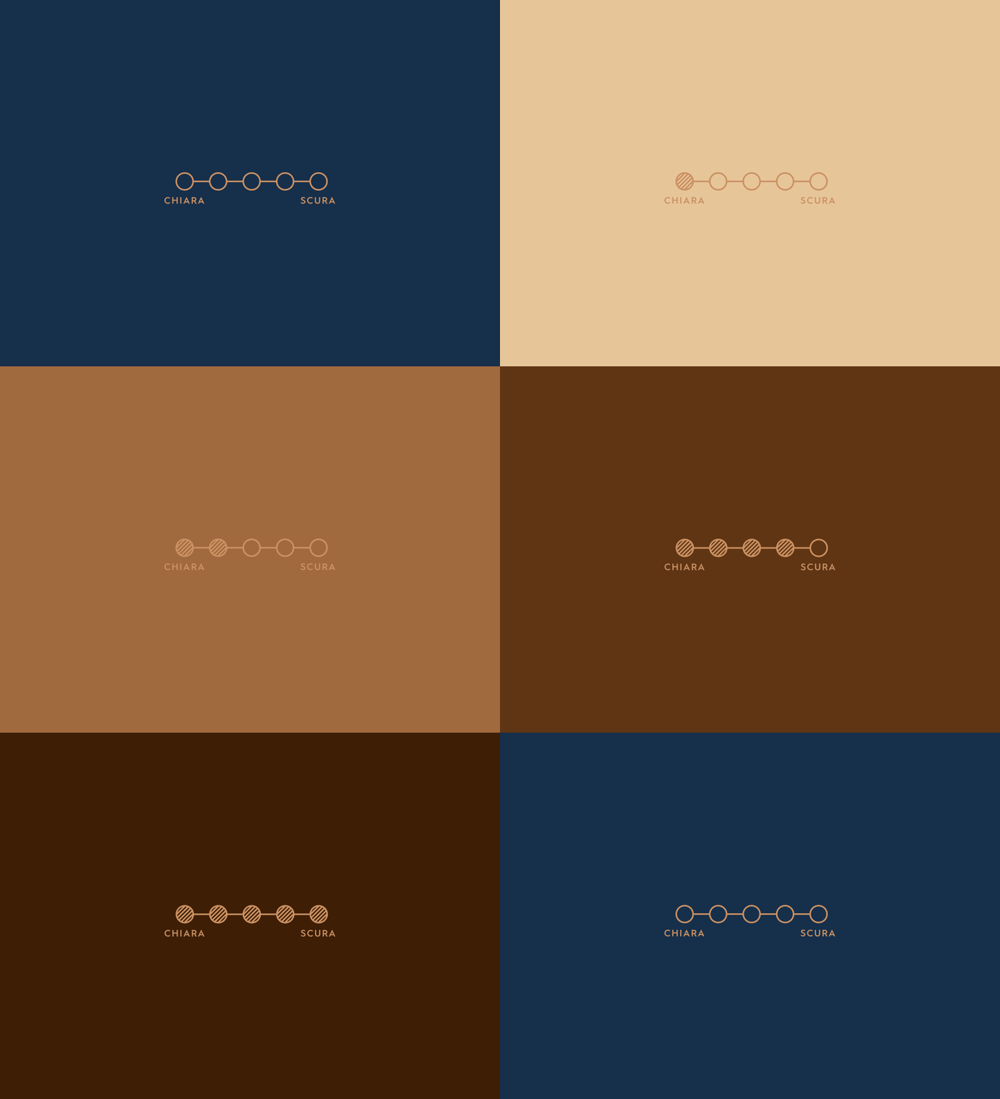
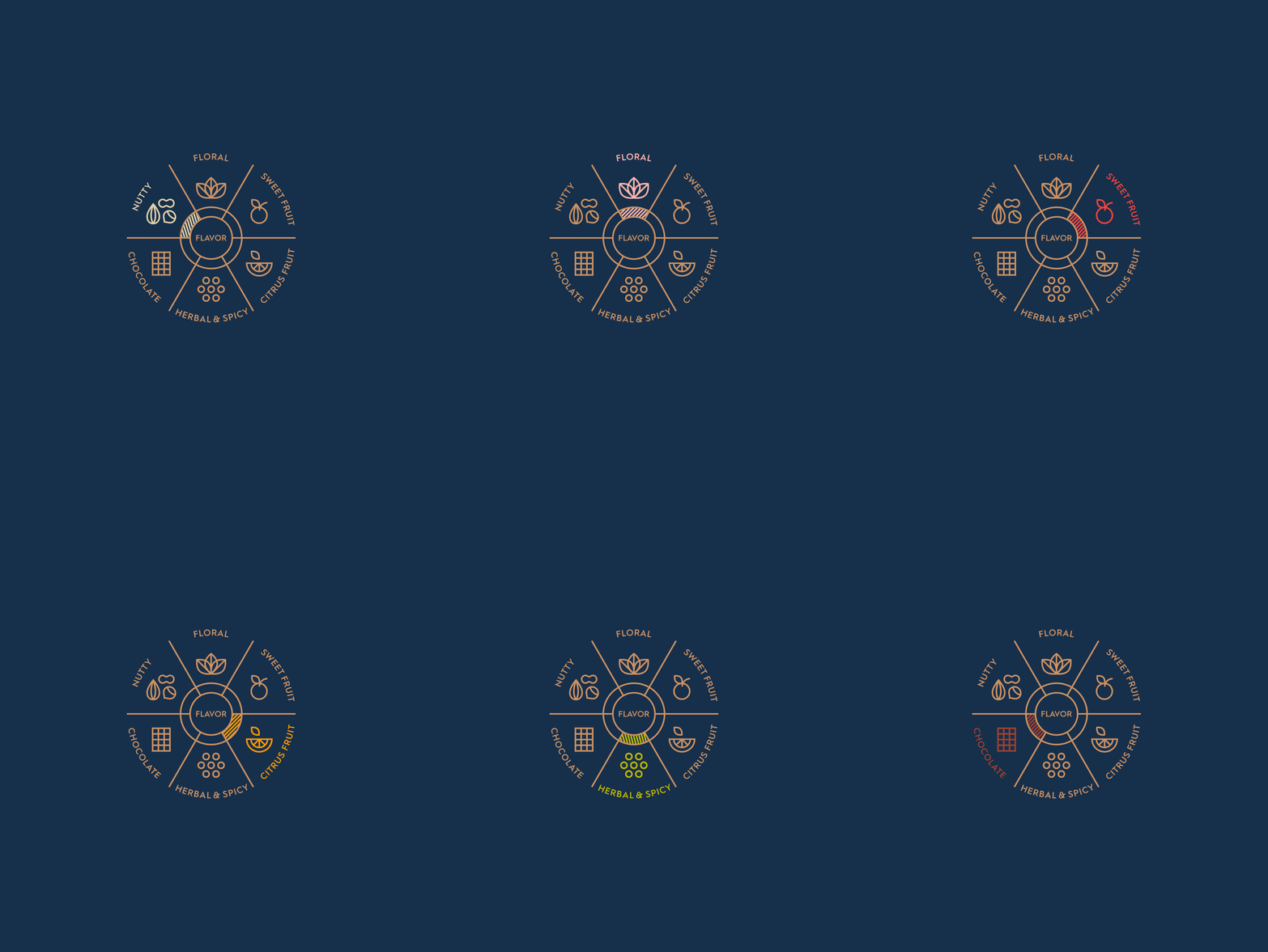
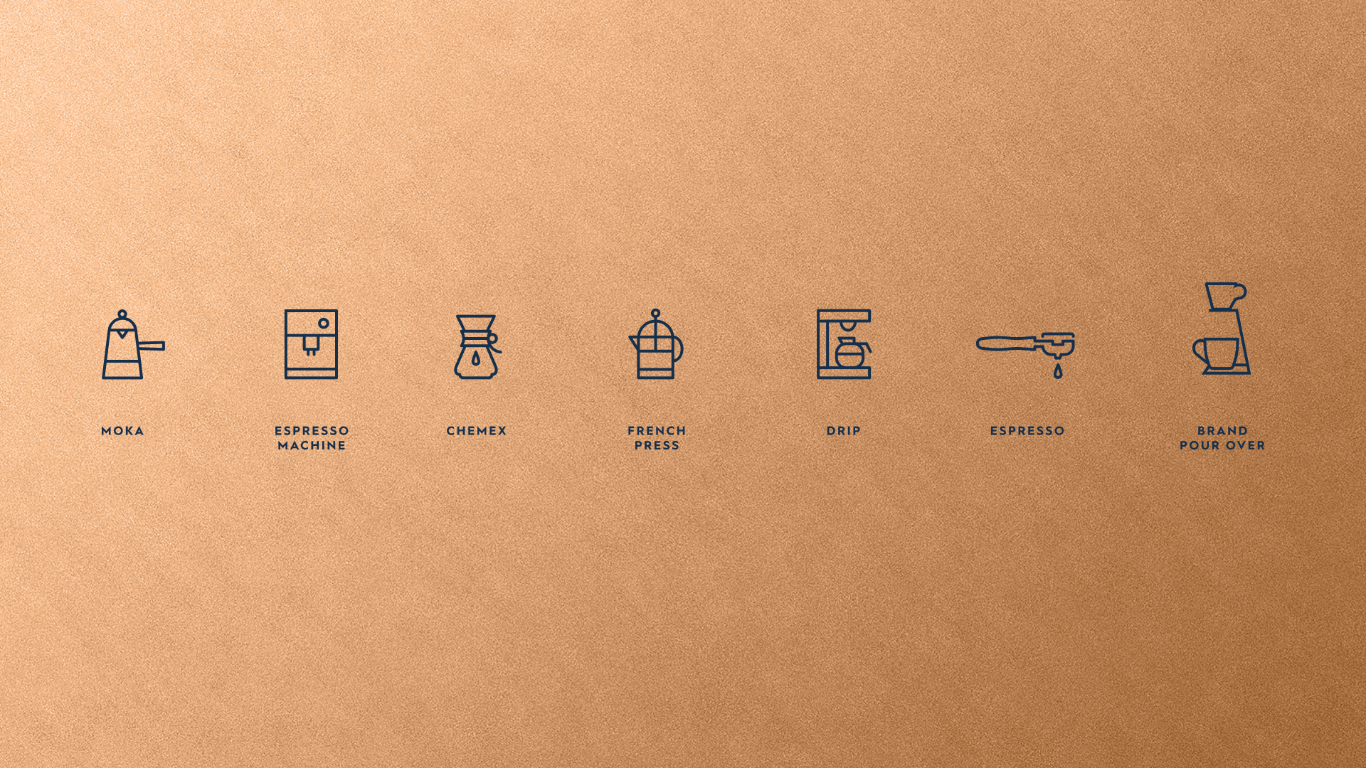
Our team developed a modular system that includes a short description, joined by infographics highlighting the flavor category, a breakdown of the composition and their origins, the roast level, and the recommended method of extraction.
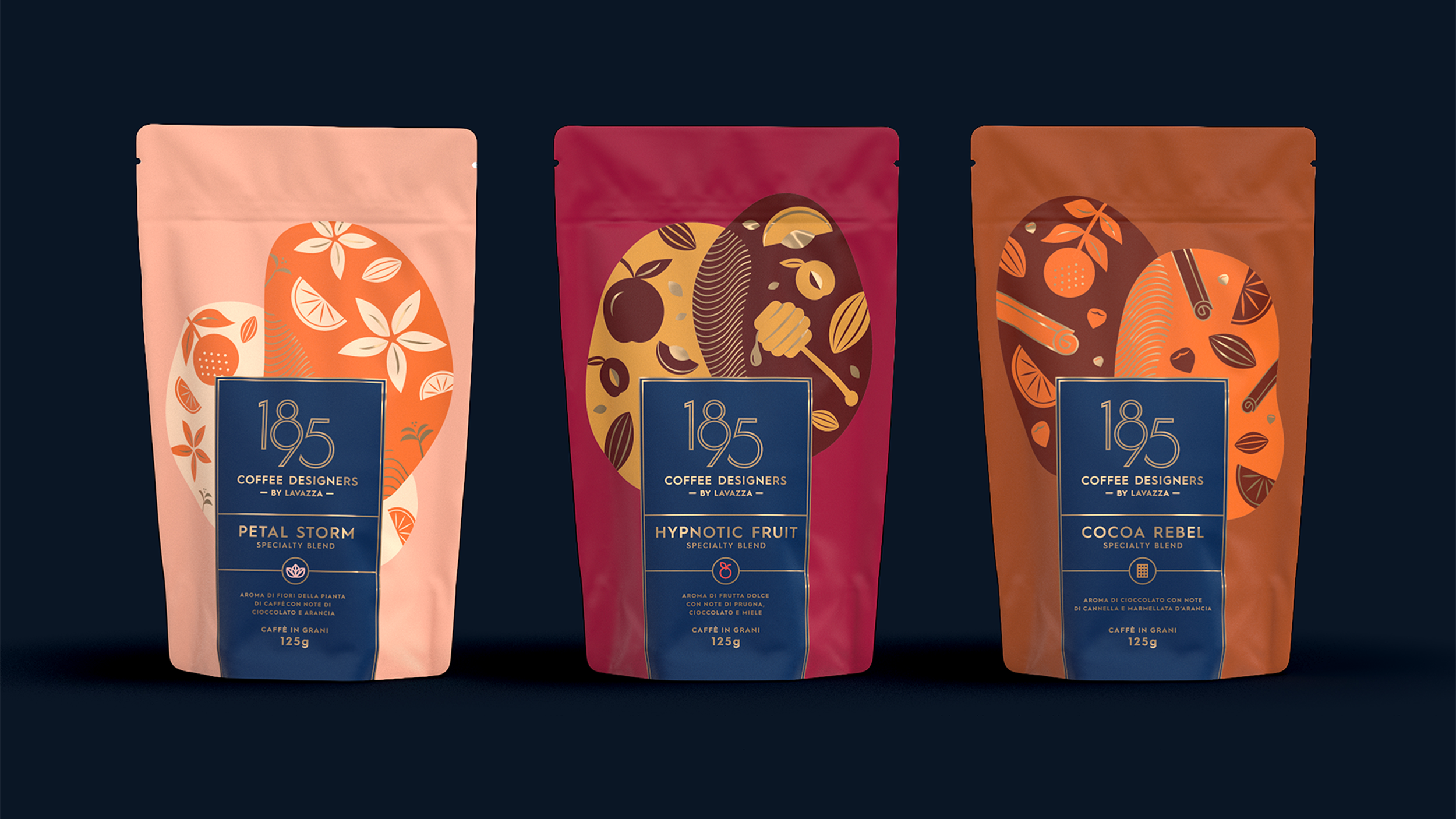
Crafted from beans sourced from many distinct coffee origins, each blend’s main flavor notes are composed in a simple illustration style, floating within two organic bean shapes in a limited palette to evoke tasteful restraint. The brand’s signature wave pattern in the cross section echoes the blended aspect. Gilded in touches of gold, the full picture emphasizes flavor in perfect harmony.
Single Origins
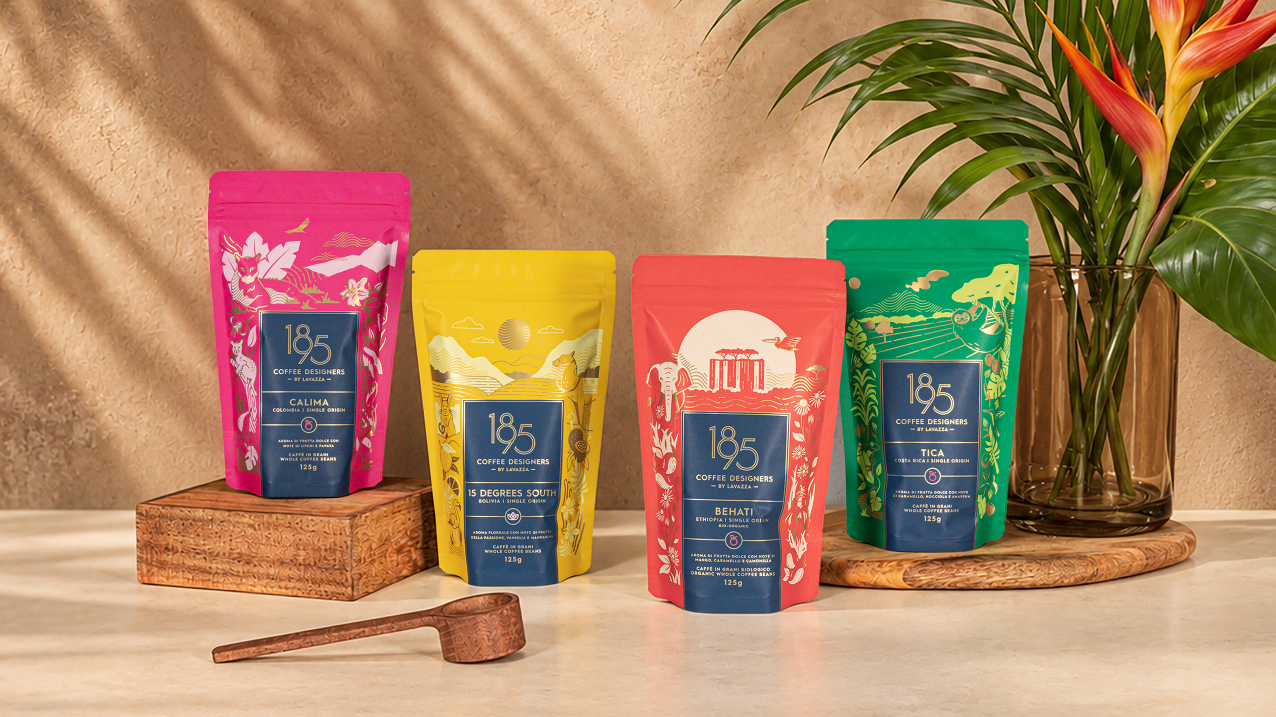
The Single-Origins deliver on where the beans were born: the unique terroir, the resulting distinct flavor profile, seasonal availability, and ultimate traceability. So the packaging required a different approach, but still needed to look like it came from the same family as the blends.
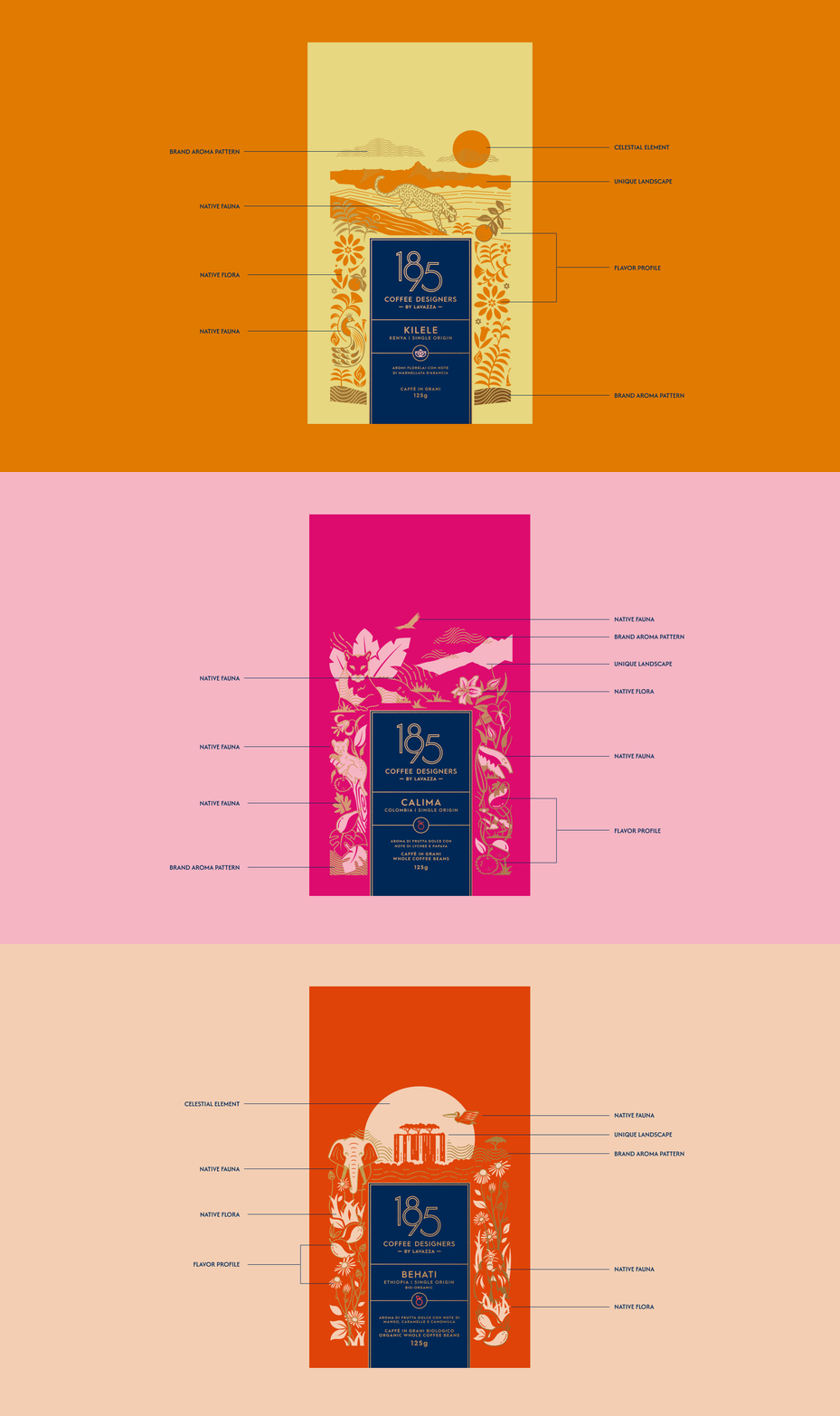
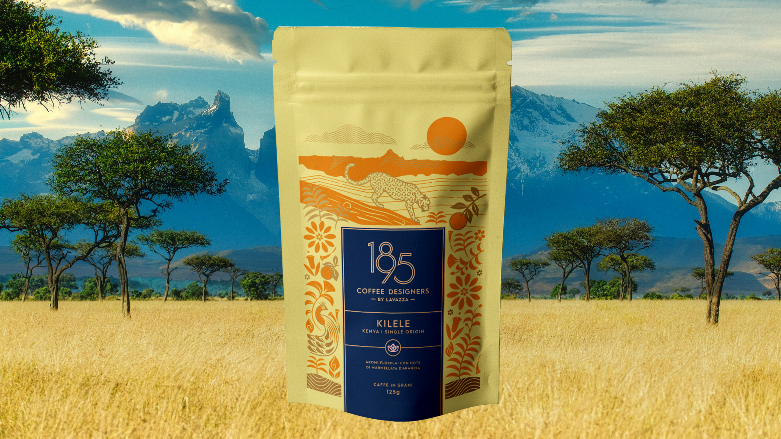
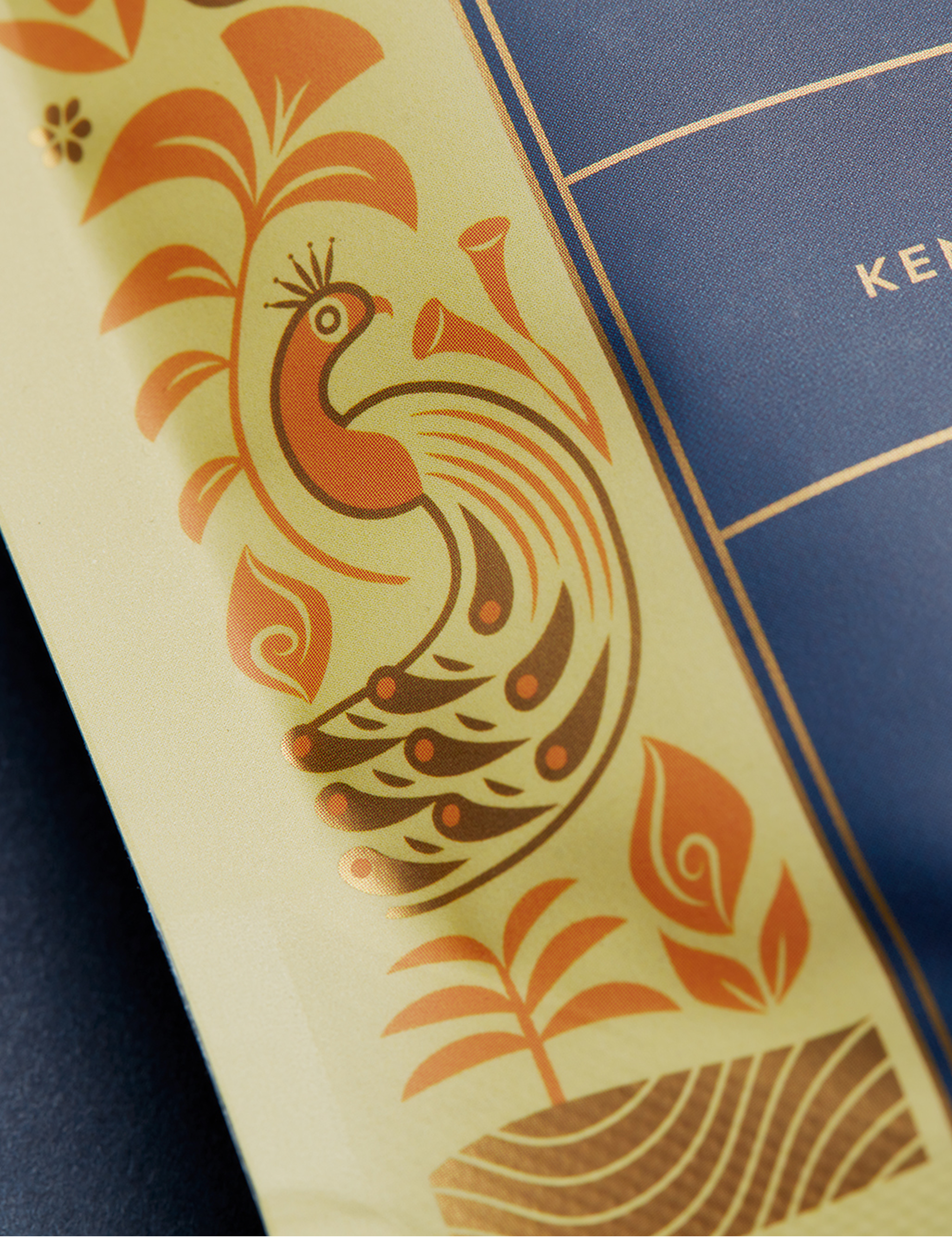
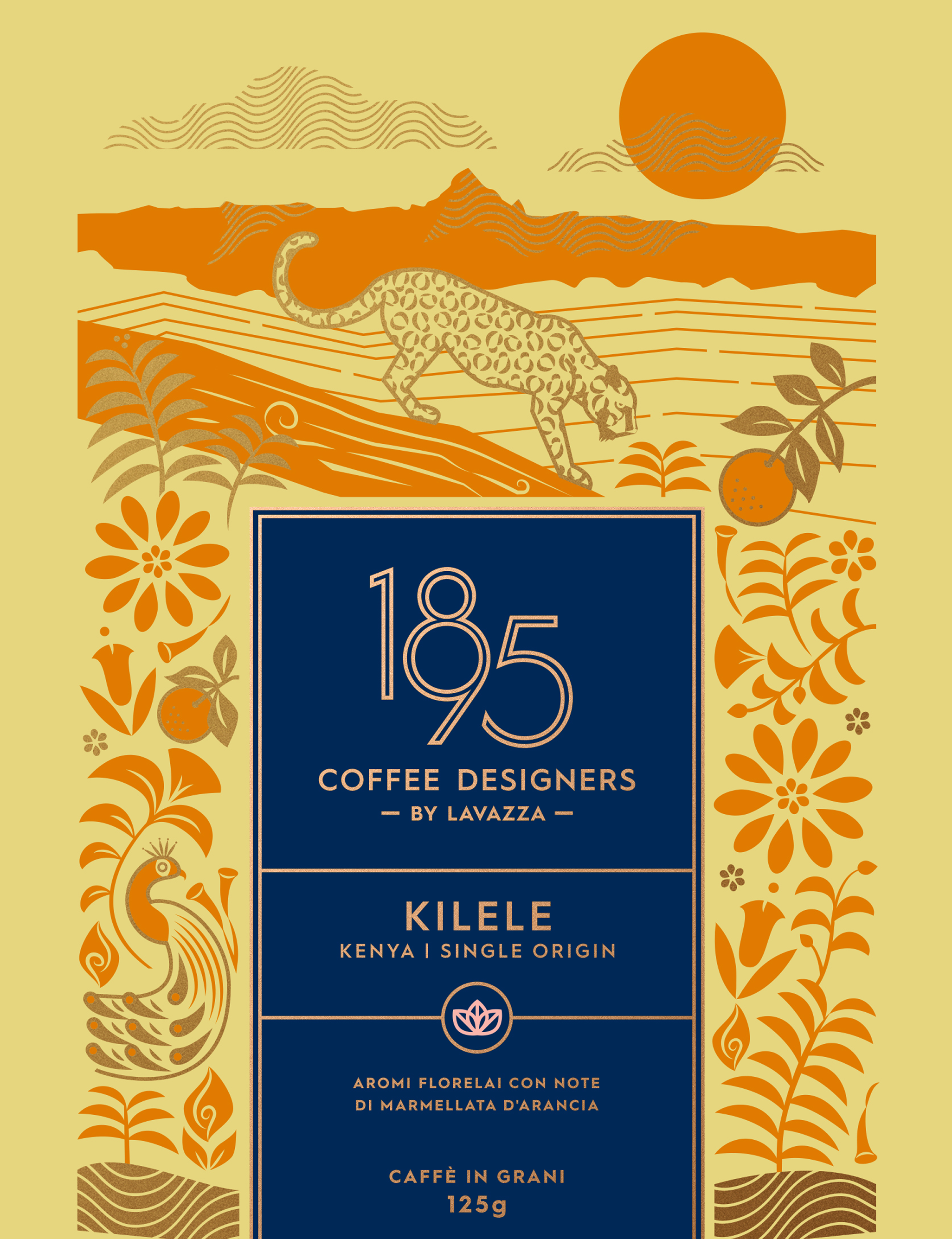
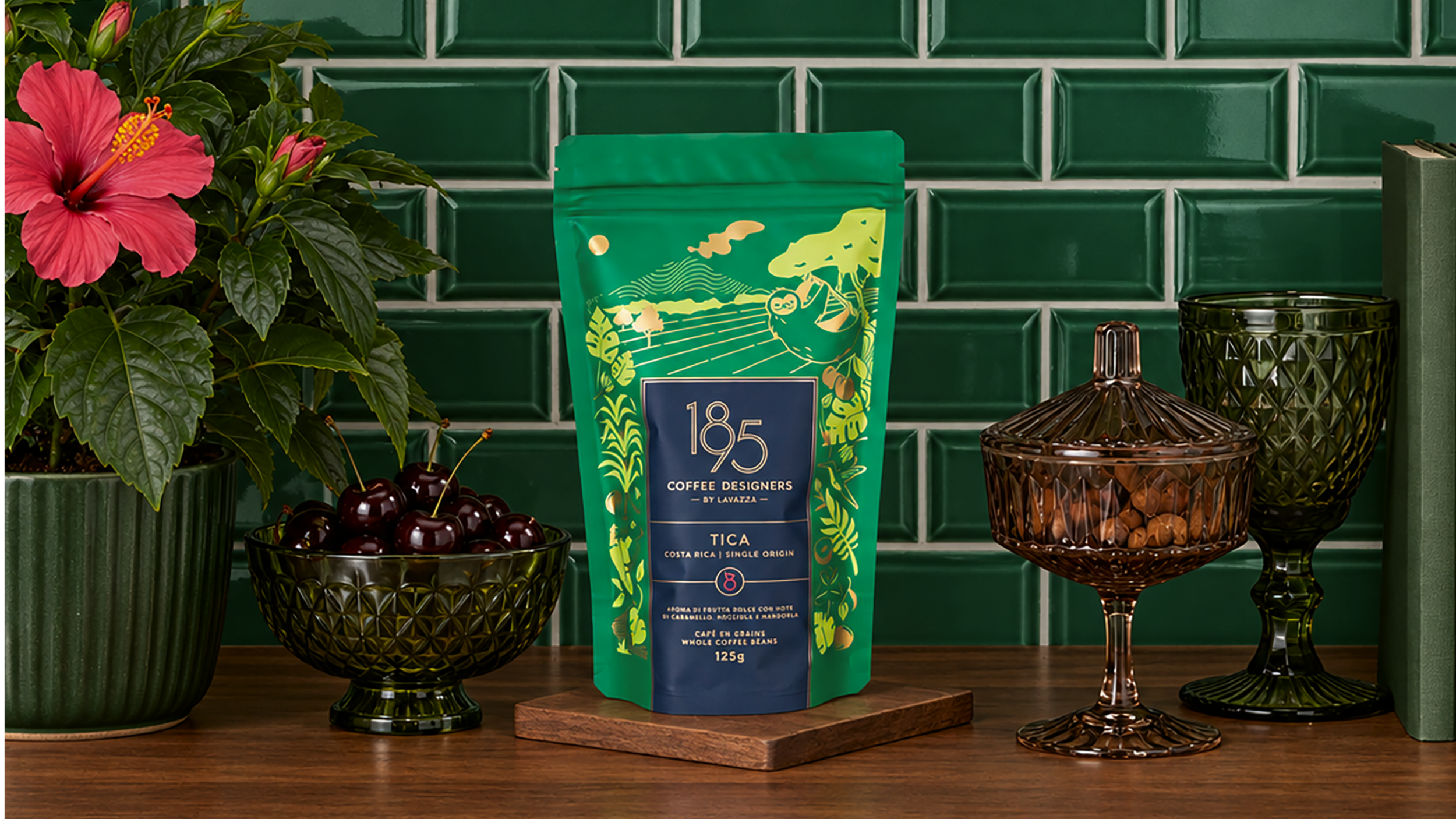
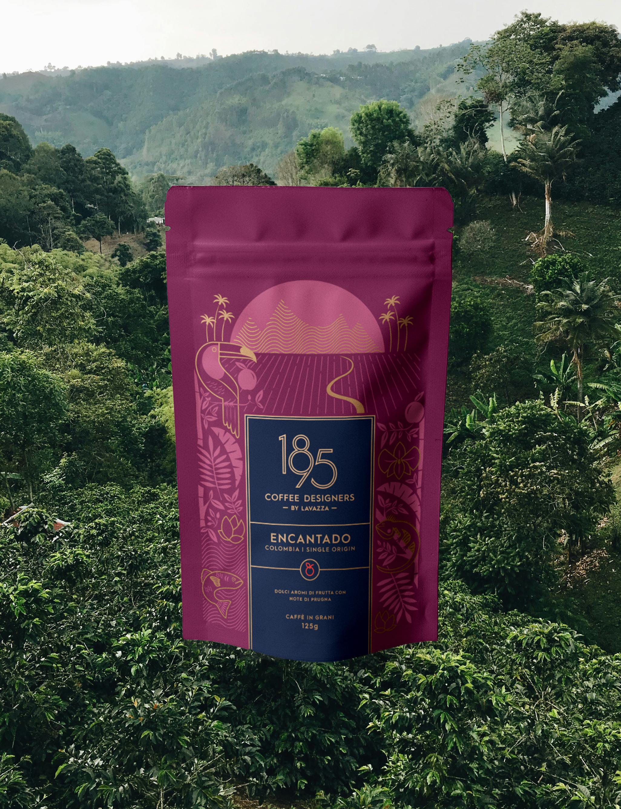
By highlighting the flora and fauna of each country of origin, these oneiric illustrations utilize the same golden detailing and simplicity of form, but add more intricate elements that weave around the blue label like a tapestry. Anchored by a landscape at the top and grounded by the brand’s wave pattern, every bag hints at the exotic offerings inside, from places of remarkable beauty across the world.
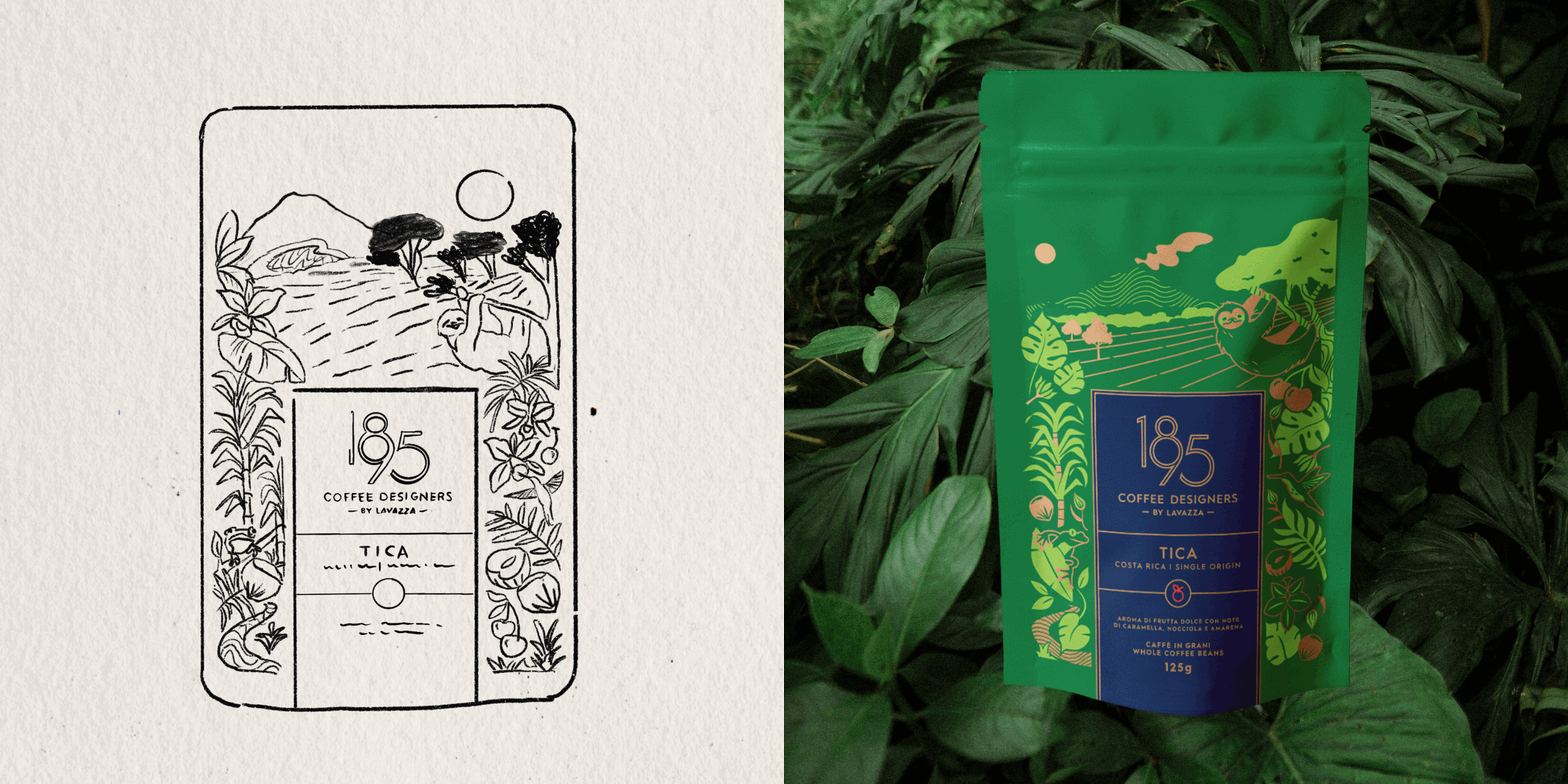
From Sketch to Bag
Naturally, with single-origin coffee being dependent on place and time, the design process for each bag had to move quickly. Every single origin design started out as a sketch. Our established visual system allowed us to promptly move into vector illustration with guidelines for line weight, color, sizing, and style.
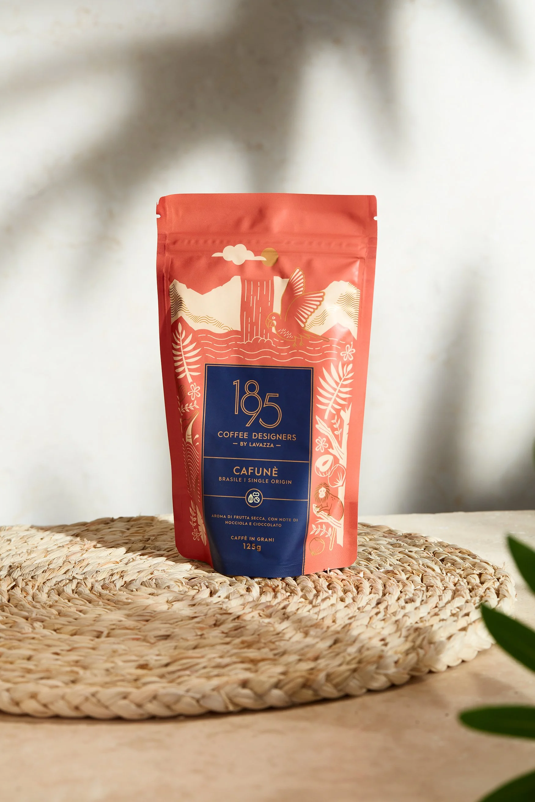
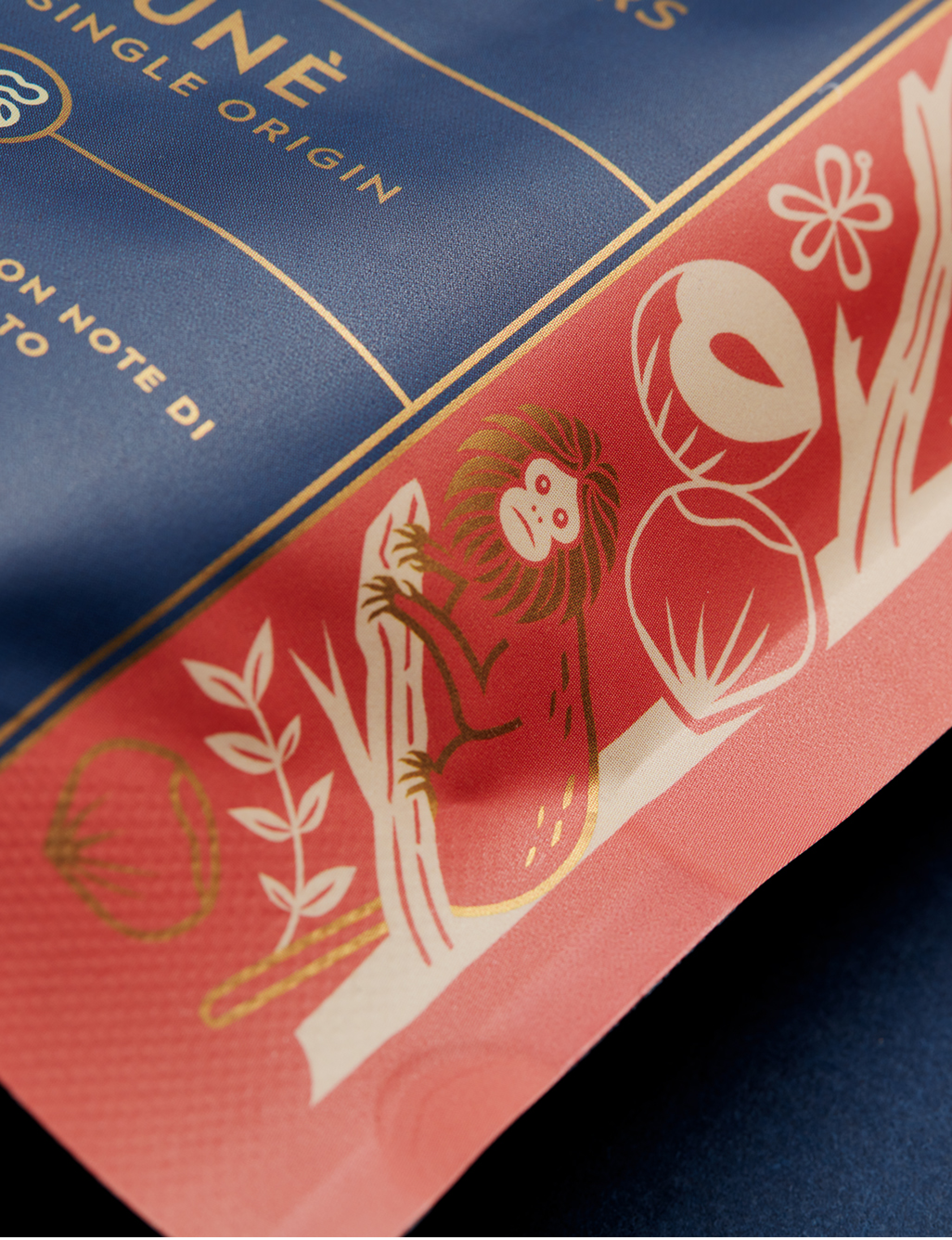
DESIGN AND ILLUSTRATION FOR CAFUNÉ: Dana Nixon
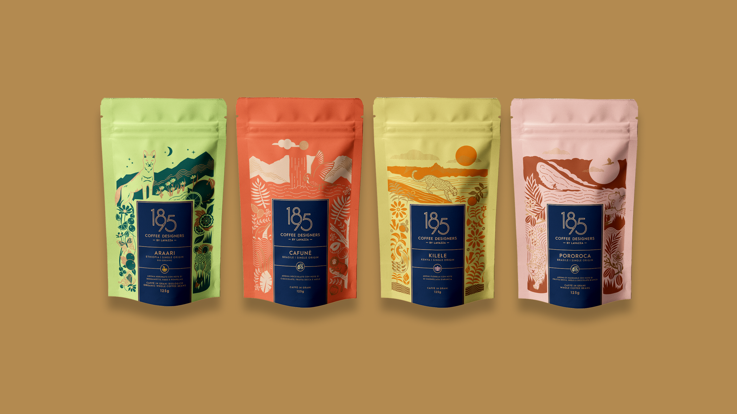
DESIGN AND ILLUSTRATION FOR ARAARI, CAFUNÉ,AND POROROCA: Dana Nixon
DESIGN AND ILLUSTRATINO FOR KILELE & ART DIRECTION: Geena SIsomphou
CREATIVE DIRECTION: Philip Smith
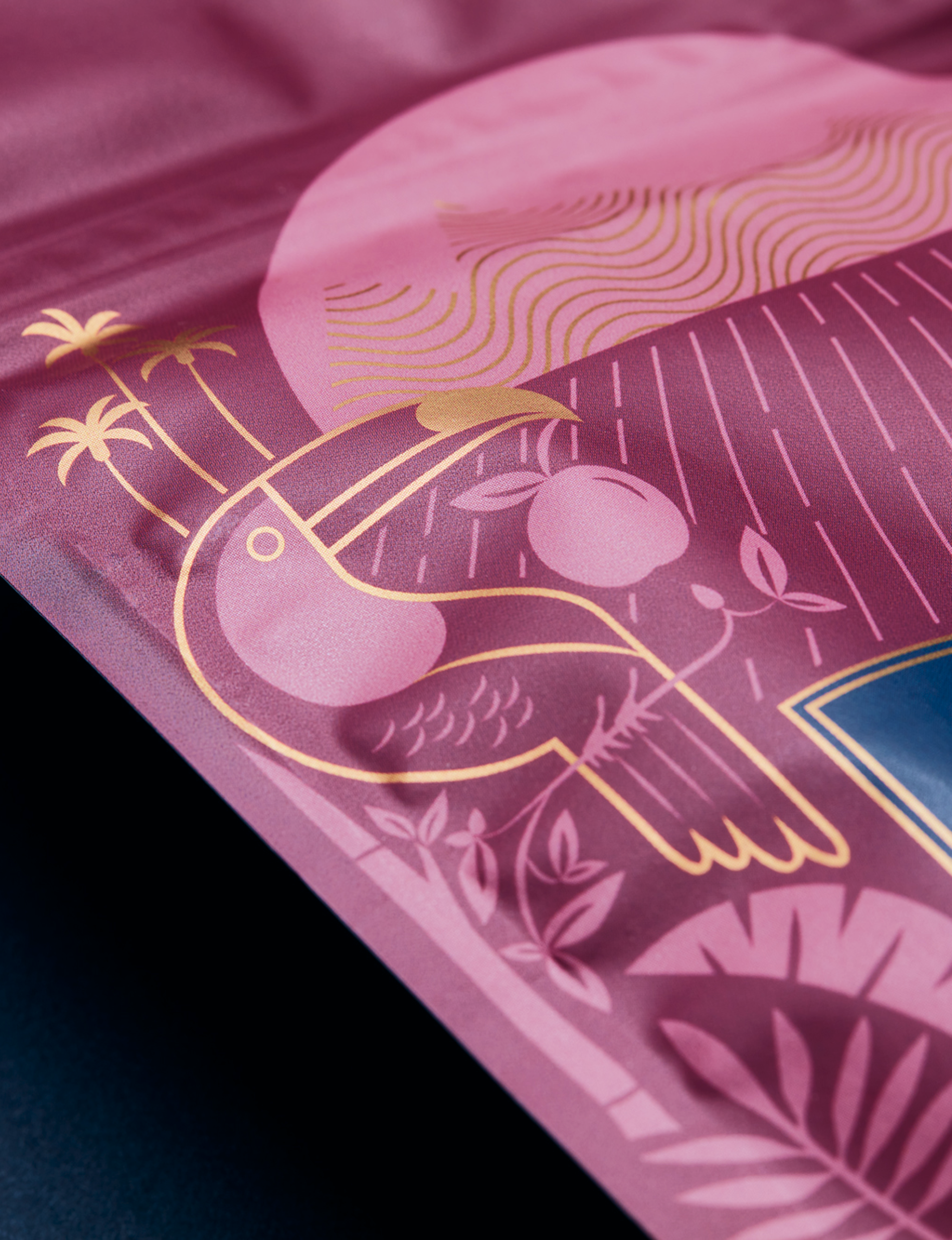
Art Direction
From 2021 - 2022, I served as art director on the project, leading a team of four, myself included. Working with a group of brilliant designers with serious illustration chops made working on this project fun, collaborative, and fluid. Our entire team was composed of women, I am also proud to say!
Over the course of only one year, we produced over 10 new bag designs.
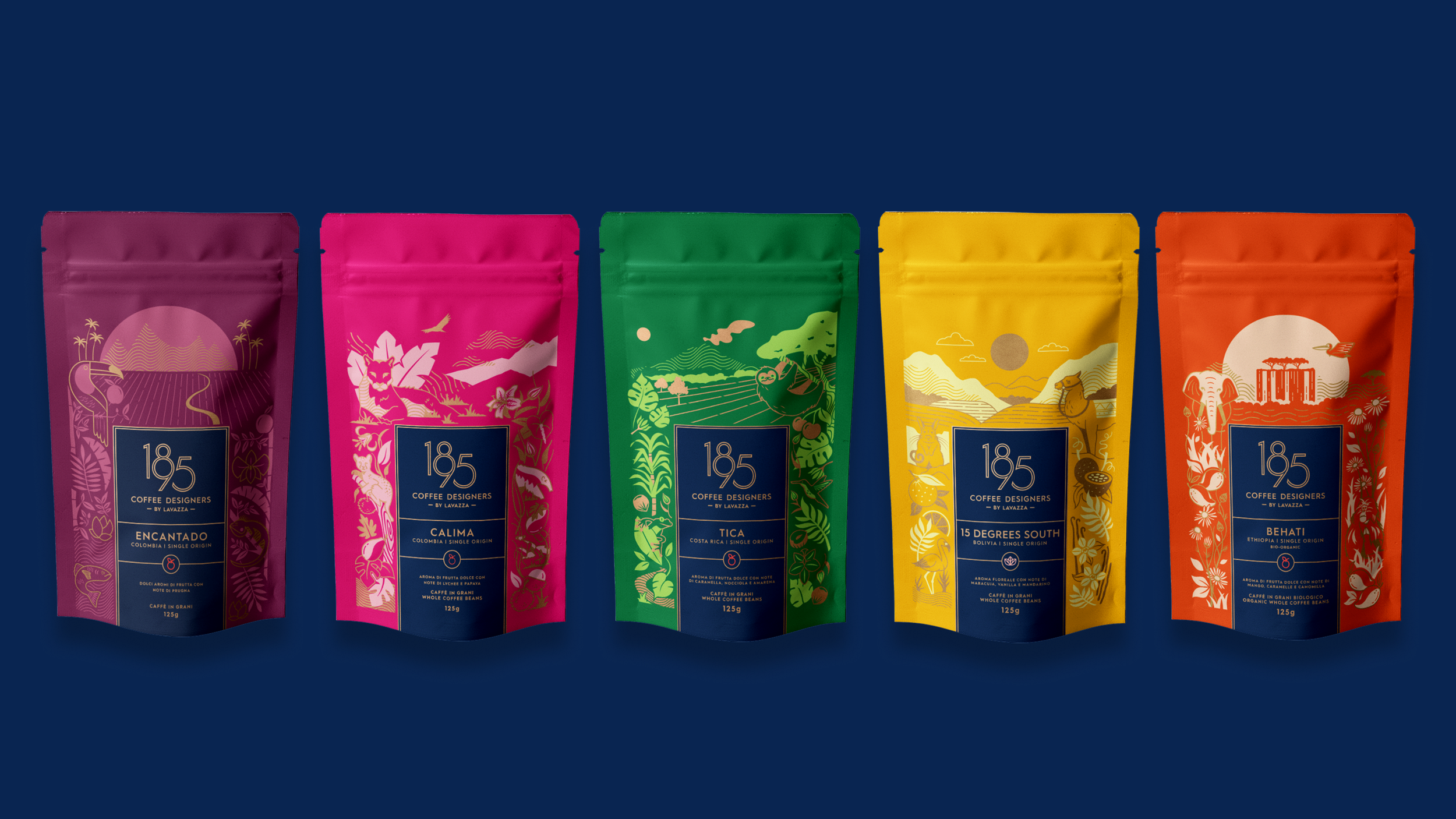
DESIGN AND ILLUSTRATION FOR ENCANTADO & TICA: Geena Sisomphou
DESIGN AND ILLUSTRATION FOR CALIMA: Yvette Sierra
DESIGN AND ILLUSTRATION FOR 15 DEGREES SOUTH: Cristina Moore
DESIGN AND ILLUSTRATION FOR BEHATI: Dana Nixon